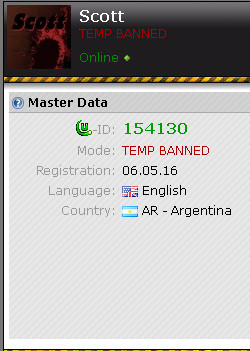
Hi,
I was thinking of something, why not add the status *TEMP BANNED* for when they are temporarily banned, maybe it's an idiotic idea, but I just wanted to share what I thought.

sorry I was wrong about the section. Admin/mod comment
please make sure to use the right language section. moved. removed useless spoiler. /DC DC Admin  Offline
This would hide the actual user mode (user, super user, game banned, moderator, ...) of that user while the user is temp banned.
Temp banned is not a user mode on its own. It's just a temporary limitation. Therefore it's wrong to display it as mode.
Also it would make several things more complicated internally. edited 1×, last 10.06.17 04:51:53 pm
@ DC: yes, I understand. it might be useful to add a red ! next to a user's mode to indicate that he\she is temp-banned, specially for +2 weeks bans
 Avo User  Offline
Well, when hover box appears when keeping a mouse cursor over somebody's nickname, it could show information if this user is temp-banned and for how long. Why would you want to know if someone is temporarily banned while reading posts anyway?
The problem with users is they feel like they need more information, when this actually destroys UI experience.
The idea of using icons for things that once have been explained are understandable is terrible for new users to grasp. It's confusing. 

 add a temp state banned
 add a temp state banned
 1
1 


 DC: yes, I understand.
 1
1 
