
 de_sift (2)
  16 like it!
 Offline
If you made this tileset or one similar, PLEASE let me know
Hey,
Carrying on with the sift maps, (using the tileset I put together) this is de_sift2. (pretty obvious from the title)
De_sift -

Compared to sift1, sift2 has smaller map boundries, and a few more boxes, meaning the gameplay with probably close-combat stuff. I spent a lot longer this time trying to balance the gameplay, in fact I think I changed a particular pathway entrance about 12 times before I was finally happy with it (the top one, just below the T spawn).
Let me know what you think!
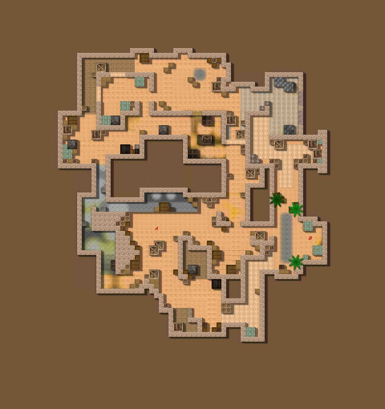
Screen 1: Map
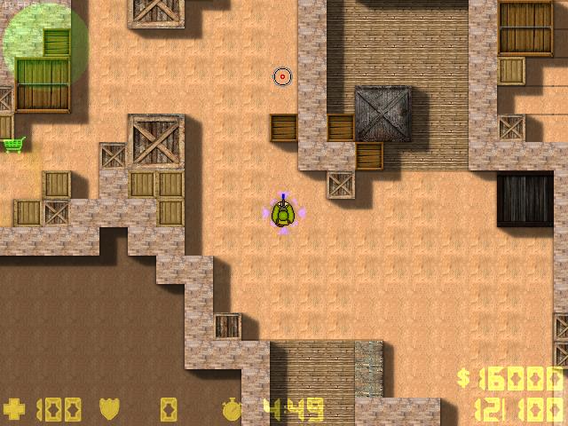
Screen 2: CT spawn
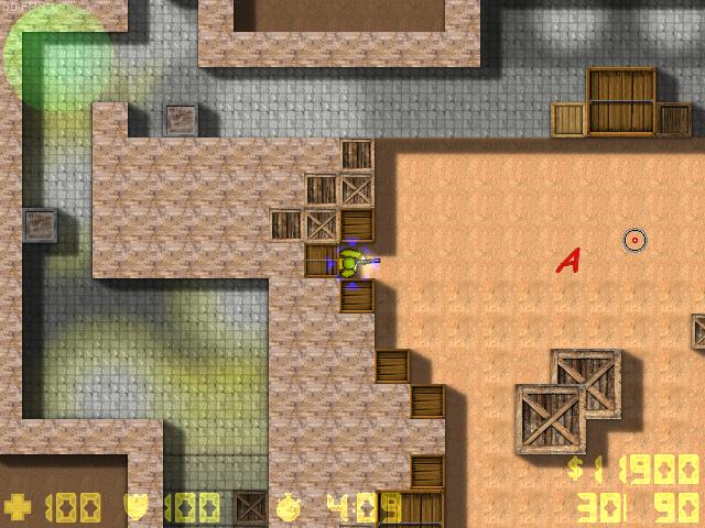
Screen 3: Bombspot A
Screen 4: T spawn
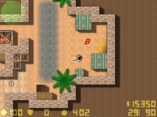
Screen 5: Take a wild guess

Approved by Sparty
 Download
226 kb, 756 Downloads

 1
1 


 there's some kind of useless paths at the top, near T spawn.
 3xuse: Thanks, but all 3 are different colours and angle rotations